节点用户界面元素
n8n 提供了一组预定义的 UI 组件(基于 JSON 文件),允许用户输入各种数据类型。以下 UI 元素在 n8n 中可用。
String
基本配置:
 1
 2
 3
 4
 5
 6
 7
 8
 9
10
11
12
13
14
15
16
17
18
{
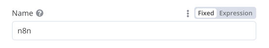
displayName : Name , // 用户在 UI 中看到的值
name : name , // 用于在代码中引用元素 UI 的名称
type : string ,
required : true , // 字段是否必需
default : 'n8n' ,
description : 'The name of the user' ,
displayOptions : { // 显示此元素的资源和操作
show : {
resource : [
// 以逗号分隔的资源名称列表
],
operation : [
// 以逗号分隔的操作名称列表
]
}
},
}
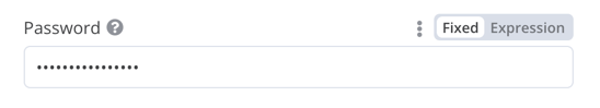
用于输入密码的字符串字段:
 1
 2
 3
 4
 5
 6
 7
 8
 9
10
11
12
13
14
15
16
17
18
19
20
21
{
displayName : 'Password' ,
name : 'password' ,
type : 'string' ,
required : true ,
typeOptions : {
password : true ,
},
default : '' ,
description : `User's password` ,
displayOptions : { // 显示此元素的资源和操作
show : {
resource : [
// 以逗号分隔的资源名称列表
],
operation : [
// 以逗号分隔的操作名称列表
]
}
},
}
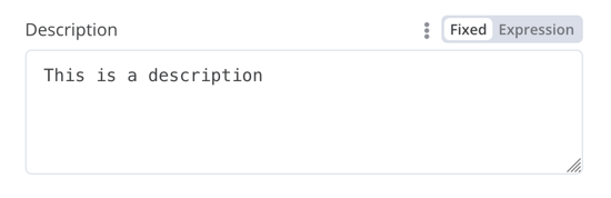
多行字符串字段:
 1
 2
 3
 4
 5
 6
 7
 8
 9
10
11
12
13
14
15
16
17
18
19
20
21
{
displayName : 'Description' ,
name : 'description' ,
type : 'string' ,
required : true ,
typeOptions : {
rows : 4 ,
},
default : '' ,
description : 'Description' ,
displayOptions : { // 显示此元素的资源和操作
show : {
resource : [
// 以逗号分隔的资源名称列表
],
operation : [
// 以逗号分隔的操作名称列表
]
}
},
}
支持数据键的拖放
用户可以拖放数据值以将其映射到字段。拖放会创建一个表达式 来加载数据值。n8n 自动支持此功能。
您需要添加额外的配置选项来支持拖放数据键:
requiresDataPath: 'single':适用于需要单个字符串的字段。requiresDataPath: 'multiple':适用于可以接受逗号分隔字符串列表的字段。
比较数据集节点代码 有示例。
Number
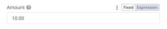
带小数点的数字字段:
 1
 2
 3
 4
 5
 6
 7
 8
 9
10
11
12
13
14
15
16
17
18
19
20
21
22
23
{
displayName : 'Amount' ,
name : 'amount' ,
type : 'number' ,
required : true ,
typeOptions : {
maxValue : 10 ,
minValue : 0 ,
numberPrecision : 2 ,
},
default : 10.00 ,
description : 'Your current amount' ,
displayOptions : { // 显示此元素的资源和操作
show : {
resource : [
// 以逗号分隔的资源名称列表
],
operation : [
// 以逗号分隔的操作名称列表
]
}
},
}
Collection
当您需要显示可选字段时,使用 collection 类型。
 1
 2
 3
 4
 5
 6
 7
 8
 9
10
11
12
13
14
15
16
17
18
19
20
21
22
23
24
25
26
27
28
29
30
31
32
33
34
35
36
37
38
39
{
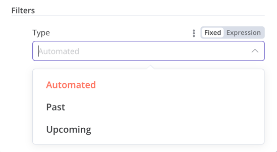
displayName : 'Filters' ,
name : 'filters' ,
type : 'collection' ,
placeholder : 'Add Field' ,
default : {},
options : [
{
displayName : 'Type' ,
name : 'type' ,
type : 'options' ,
options : [
{
name : 'Automated' ,
value : 'automated' ,
},
{
name : 'Past' ,
value : 'past' ,
},
{
name : 'Upcoming' ,
value : 'upcoming' ,
},
],
default : '' ,
},
],
displayOptions : { // 显示此元素的资源和操作
show : {
resource : [
// 以逗号分隔的资源名称列表
],
operation : [
// 以逗号分隔的操作名称列表
]
}
},
}
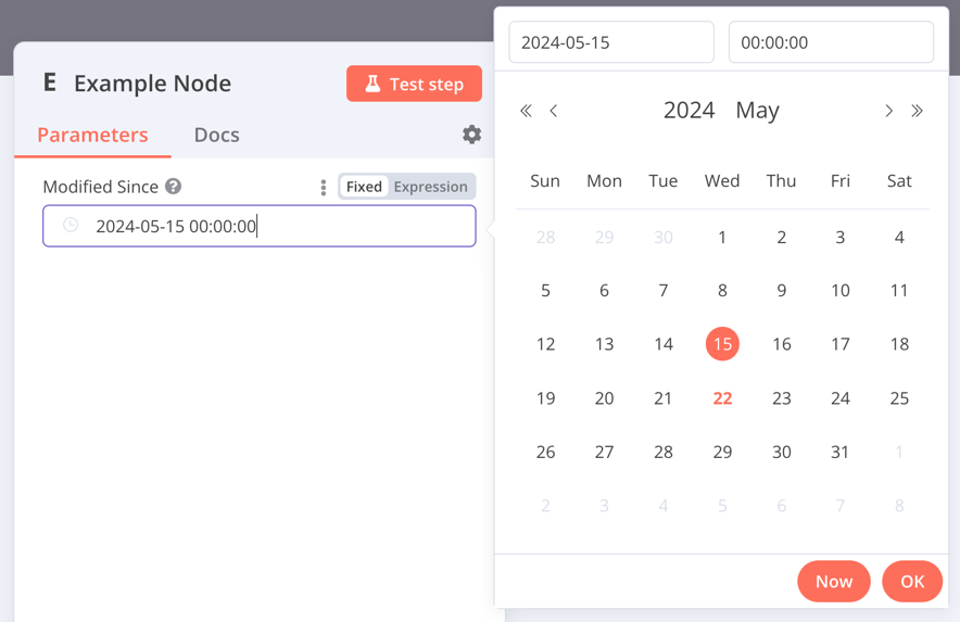
DateTime
dateTime 类型提供日期选择器。
 1
 2
 3
 4
 5
 6
 7
 8
 9
10
11
12
13
14
15
16
17
{
displayName : 'Modified Since' ,
name : 'modified_since' ,
type : 'dateTime' ,
default : '' ,
description : 'The date and time when the file was last modified' ,
displayOptions : { // 显示此元素的资源和操作
show : {
resource : [
// 以逗号分隔的资源名称列表
],
operation : [
// 以逗号分隔的操作名称列表
]
}
},
}
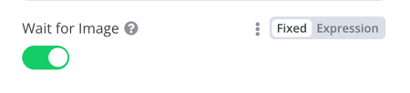
Boolean
boolean 类型添加了一个用于输入 true 或 false 的切换开关。
 1
 2
 3
 4
 5
 6
 7
 8
 9
10
11
12
13
14
15
16
17
{
displayName : 'Wait for Image' ,
name : 'waitForImage' ,
type : 'boolean' ,
default : true , // 切换开关的初始状态
description : 'Whether to wait for the image or not' ,
displayOptions : { // 显示此元素的资源和操作
show : {
resource : [
// 以逗号分隔的资源名称列表
],
operation : [
// 以逗号分隔的操作名称列表
]
}
},
}
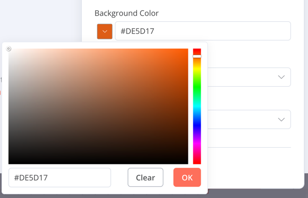
Color
color 类型提供颜色选择器。
 1
 2
 3
 4
 5
 6
 7
 8
 9
10
11
12
13
14
15
16
{
displayName : 'Background Color' ,
name : 'backgroundColor' ,
type : 'color' ,
default : '' , // 初始选择的颜色
displayOptions : { // 显示此元素的资源和操作
show : {
resource : [
// 以逗号分隔的资源名称列表
],
operation : [
// 以逗号分隔的操作名称列表
]
}
},
}
Options
options 类型添加选项列表。用户可以选择单个值。
1
2
3
4
5
6
7
8
9
10
11
12
13
14
15
16
17
18
19
20
21
22
23
24
25
26
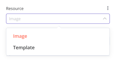
27 {
displayName : 'Resource' ,
name : 'resource' ,
type : 'options' ,
options : [
{
name : 'Image' ,
value : 'image' ,
},
{
name : 'Template' ,
value : 'template' ,
},
],
default : 'image' , // 初始选择的选项
description : 'Resource to consume' ,
displayOptions : { // 显示此元素的资源和操作
show : {
resource : [
// 以逗号分隔的资源名称列表
],
operation : [
// 以逗号分隔的操作名称列表
]
}
},
}
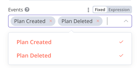
Multi-options
multiOptions 类型添加选项列表。用户可以选择多个值。
 1
 2
 3
 4
 5
 6
 7
 8
 9
10
11
12
13
14
15
16
17
18
19
20
21
22
23
24
25
26
27
{
displayName : 'Events' ,
name : 'events' ,
type : 'multiOptions' ,
options : [
{
name : 'Plan Created' ,
value : 'planCreated' ,
},
{
name : 'Plan Deleted' ,
value : 'planDeleted' ,
},
],
default : [], // 初始选择的选项
description : 'The events to be monitored' ,
displayOptions : { // 显示此元素的资源和操作
show : {
resource : [
// 以逗号分隔的资源名称列表
],
operation : [
// 以逗号分隔的操作名称列表
]
}
},
}
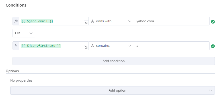
Filter
使用此组件来评估、匹配或过滤传入的数据。
这是来自 n8n 自己的 If 节点的代码。它显示了一个过滤器组件与集合 组件一起工作,用户可以在其中配置过滤器的行为。
 1
 2
 3
 4
 5
 6
 7
 8
 9
10
11
12
13
14
15
16
17
18
19
20
21
22
23
24
25
26
27
28
29
30
31
32
33
34
35
36
37
{
displayName : 'Conditions' ,
name : 'conditions' ,
placeholder : 'Add Condition' ,
type : 'filter' ,
default : {},
typeOptions : {
filter : {
// 使用用户选项(下面)来确定过滤器行为
caseSensitive : '={{!$parameter.options.ignoreCase}}' ,
typeValidation : '={{$parameter.options.looseTypeValidation ? "loose" : "strict"}}' ,
},
},
},
{
displayName : 'Options' ,
name : 'options' ,
type : 'collection' ,
placeholder : 'Add option' ,
default : {},
options : [
{
displayName : 'Ignore Case' ,
description : 'Whether to ignore letter case when evaluating conditions' ,
name : 'ignoreCase' ,
type : 'boolean' ,
default : true ,
},
{
displayName : 'Less Strict Type Validation' ,
description : 'Whether to try casting value types based on the selected operator' ,
name : 'looseTypeValidation' ,
type : 'boolean' ,
default : true ,
},
],
},
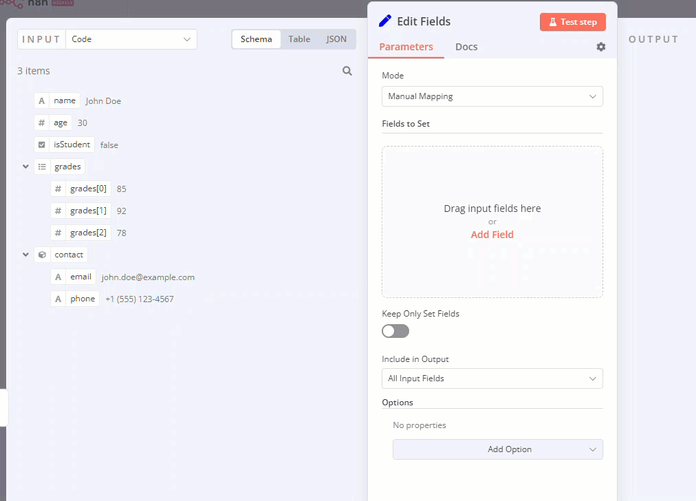
Assignment collection (拖放)
当您希望用户通过单次拖动交互预填充名称和值参数时,使用拖放组件。
{
displayName : 'Fields to Set' ,
name : 'assignments' ,
type : 'assignmentCollection' ,
default : {},
},
您可以在 n8n 的编辑字段(设置)节点 中看到示例:
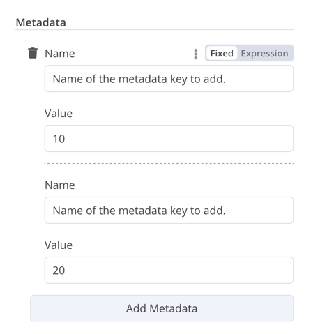
Fixed collection
使用 fixedCollection 类型将语义相关的字段分组。
1
2
3
4
5
6
7
8
9
10
11
12
13
14
15
16
17
18
19
20
21
22
23
24
25
26
27
28
29
30
31
32
33
34
35
36
37
38
39
40
41
42 {
displayName : 'Metadata' ,
name : 'metadataUi' ,
placeholder : 'Add Metadata' ,
type : 'fixedCollection' ,
default : '' ,
typeOptions : {
multipleValues : true ,
},
description : '' ,
options : [
{
name : 'metadataValues' ,
displayName : 'Metadata' ,
values : [
{
displayName : 'Name' ,
name : 'name' ,
type : 'string' ,
default : 'Name of the metadata key to add.' ,
},
{
displayName : 'Value' ,
name : 'value' ,
type : 'string' ,
default : '' ,
description : 'Value to set for the metadata key.' ,
},
],
},
],
displayOptions : { // 显示此元素的资源和操作
show : {
resource : [
// 以逗号分隔的资源名称列表
],
operation : [
// 以逗号分隔的操作名称列表
]
}
},
}
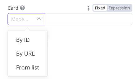
Resource locator
资源定位器元素帮助用户在外部服务中找到特定资源,例如 Trello 中的卡片或标签。
可用的选项包括:
ID
URL
列表:允许用户从预填充的列表中选择或搜索。此选项需要更多编码,因为您必须填充列表,并在选择支持搜索时处理搜索。
您可以选择要包含的类型。
示例:
 1
 2
 3
 4
 5
 6
 7
 8
 9
10
11
12
13
14
15
16
17
18
19
20
21
22
23
24
25
26
27
28
29
30
31
32
33
34
35
36
37
38
39
40
41
42
43
44
45
46
47
48
49
50
51
52
53
54
55
56
57
58
59
60
61
62
63
64
65
66
67
68
69
70
71
72
73
74
75
76 {
displayName : 'Card' ,
name : 'cardID' ,
type : 'resourceLocator' ,
default : '' ,
description : 'Get a card' ,
modes : [
{
displayName : 'ID' ,
name : 'id' ,
type : 'string' ,
hint : 'Enter an ID' ,
validation : [
{
type : 'regex' ,
properties : {
regex : '^[0-9]' ,
errorMessage : 'The ID must start with a number' ,
},
},
],
placeholder : '12example' ,
// 如何在 API 调用中使用 ID
url : '=http://api-base-url.com/?id={{$value}}' ,
},
{
displayName : 'URL' ,
name : 'url' ,
type : 'string' ,
hint : 'Enter a URL' ,
validation : [
{
type : 'regex' ,
properties : {
regex : '^http' ,
errorMessage : 'Invalid URL' ,
},
},
],
placeholder : 'https://example.com/card/12example/' ,
// 如何从 URL 获取 ID
extractValue : {
type : 'regex' ,
regex : 'example.com/card/([0-9]*.*)/' ,
},
},
{
displayName : 'List' ,
name : 'list' ,
type : 'list' ,
typeOptions : {
// 您必须始终提供搜索方法
// 在基础文件的 methods 对象中编写此方法
// 该方法必须填充列表,并在 searchable: true 时处理搜索
searchListMethod : 'searchMethod' ,
// 如果您希望用户能够搜索列表
searchable : true ,
// 如果您希望强制用户搜索,请设置为 true
// 当为 true 时,用户无法浏览列表
// 或者如果用户可以浏览列表,则设置为 false
searchFilterRequired : true ,
},
},
],
displayOptions : {
// 显示此元素的资源和操作
show : {
resource : [
// 以逗号分隔的资源名称列表
],
operation : [
// 以逗号分隔的操作名称列表
],
},
},
},
参考以下实际示例:
Resource mapper
如果您的节点执行插入、更新或 upsert 操作,您需要以集成服务支持的格式从节点发送数据。一个常见的模式是在发送数据的节点之前使用 Set 节点,将数据转换为匹配您连接的服务的模式。资源映射器 UI 组件提供了一种直接在节点内将数据转换为所需格式的方法,而不是使用 Set 节点。资源映射器组件还可以根据节点中提供的模式验证输入数据,并将输入数据转换为预期的类型。
映射和匹配
映射是设置输入数据用作更新行时的值的过程。匹配是使用列名标识要更新的行的过程。
 1
 2
 3
 4
 5
 6
 7
 8
 9
10
11
12
13
14
15
16
17
18
19
20
21
22
23
24
25
26
27
28
29
30
31
32
{
displayName : 'Columns' ,
name : 'columns' , // 用于在代码中引用元素 UI 的名称
type : 'resourceMapper' , // UI 元素类型
default : {
// mappingMode 可以在组件中定义(mappingMode: 'defineBelow')
// 或者您可以尝试自动映射(mappingMode: 'autoMapInputData')
mappingMode : 'defineBelow' ,
// 重要:始终将默认值设置为 null
value : null ,
},
required : true ,
// 有关完整的 typeOptions 规范,请参阅下面的"资源映射器类型选项接口"
typeOptions : {
resourceMapper : {
resourceMapperMethod : 'getMappingColumns' ,
mode : 'update' ,
fieldWords : {
singular : 'column' ,
plural : 'columns' ,
},
addAllFields : true ,
multiKeyMatch : true ,
supportAutoMap : true ,
matchingFieldsLabels : {
title : 'Custom matching columns title' ,
description : 'Help text for custom matching columns' ,
hint : 'Below-field hint for custom matching columns' ,
},
},
},
},
参考 Postgres 节点(版本 2) 了解使用数据库模式的实际示例。
参考 Google Sheets 节点(版本 2) 了解使用无模式服务的实际示例。
资源映射器类型选项接口
typeOptions 部分必须实现以下接口:
 1
 2
 3
 4
 5
 6
 7
 8
 9
10
11
12
13
14
15
16
17
18
19
20
21
22
23
24
25
26
27
28
29
30
export interface ResourceMapperTypeOptions {
// 您获取模式的方法名称
// 有关更多详细信息,请参阅资源映射器方法部分
resourceMapperMethod : string ;
// 为您的操作选择模式
// 支持的模式:add、update、upsert
mode : 'add' | 'update' | 'upsert' ;
// 为 UI 中的字段指定标签
fieldWords ?: { singular : string ; plural : string };
// 当节点首次添加到工作流时,n8n 是否应为每个字段显示 UI 输入
// 默认为 true
addAllFields ?: boolean ;
// 如果从服务获取的字段为空,则指定要显示的消息
//(调用成功但响应为空)
noFieldsError ?: string ;
// 是否支持多键列匹配
// multiKeyMatch 仅适用于 update 和 upsert
// 默认为 false
// 如果为 true,节点会为匹配列选择器显示多选下拉菜单
multiKeyMatch ?: boolean ;
// 是否支持自动映射
// 如果为 false,n8n 隐藏映射模式选择器字段并将 mappingMode 设置为 defineBelow
supportAutoMap ?: boolean ;
// 匹配列选择器的自定义标签
matchingFieldsLabels ?: {
title ?: string ;
description ?: string ;
hint ?: string ;
};
}
资源映射器方法
此方法包含用于获取数据模式的节点特定逻辑。每个节点都必须实现自己的获取模式逻辑,并根据模式设置每个 UI 字段。
它必须返回实现 ResourceMapperFields 接口的值:
 1
 2
 3
 4
 5
 6
 7
 8
 9
10
11
12
13
14
15
16
17
18
19
20
21
22
23
24
interface ResourceMapperField {
// 服务中的字段 ID
id : string ;
// 字段标签
displayName : string ;
// n8n 是否应将字段预选为匹配字段
// 匹配字段是用于标识要修改的行的列
defaultMatch : boolean ;
// 字段是否可以用作匹配字段
canBeUsedToMatch ?: boolean ;
// 模式是否需要该字段
required : boolean ;
// 是否在 UI 中显示字段
// 如果为 false,则不能用于匹配或映射
display : boolean ;
// 字段的数据类型
// 这些对应于 UI 元素类型
// 支持的类型:string、number、dateTime、boolean、time、array、object、options
type ?: FieldType ;
// 如果用户从映射中删除字段,则在运行时添加
removed ?: boolean ;
// 为枚举类型指定选项
options ?: INodePropertyOptions [];
}
参考 Postgres 资源映射方法 和 Google Sheets 资源映射方法 了解实际示例。
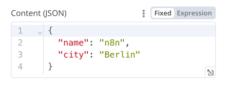
JSON
 1
 2
 3
 4
 5
 6
 7
 8
 9
10
11
12
13
14
15
16
17
{
displayName : 'Content (JSON)' ,
name : 'content' ,
type : 'json' ,
default : '' ,
description : '' ,
displayOptions : { // 显示此元素的资源和操作
show : {
resource : [
// 以逗号分隔的资源名称列表
],
operation : [
// 以逗号分隔的操作名称列表
]
}
},
}
HTML
HTML 编辑器允许用户在其工作流中创建 HTML 模板。编辑器支持标准 HTML、<style> 标签中的 CSS 以及包装在 {{}} 中的表达式。用户可以添加 <script> 标签来引入额外的 JavaScript。n8n 在工作流执行期间不会运行此 JavaScript。
{
displayName : 'HTML Template' , // 用户在 UI 中看到的值
name : 'html' , // 用于在代码中引用元素 UI 的名称
type : 'string' ,
typeOptions : {
editor : 'htmlEditor' ,
},
default : placeholder , // 加载 n8n 的占位符 HTML 模板
noDataExpression : true , // 防止对字段使用表达式
description : 'HTML template to render' ,
},
参考 Html.node.ts
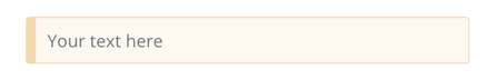
Notice
显示带有提示或额外信息的黄色框。参考节点 UI 设计 了解编写良好提示和信息文本的指导。
{
displayName : 'Your text here' ,
name : 'notice' ,
type : 'notice' ,
default : '' ,
},
Hints
有两种类型的提示:参数提示和节点提示:
参数提示是用户输入字段下方的小文本行。
节点提示是比Notice 更强大和灵活的选项。使用它们在输入面板、输出面板或节点详细信息视图中显示较长的提示。
添加参数提示
向 UI 元素添加 hint 参数:
{
displayName : 'URL' ,
name : 'url' ,
type : 'string' ,
hint : 'Enter a URL' ,
...
}
添加节点提示
在节点 description 的 hints 属性中定义节点的提示:
 1
 2
 3
 4
 5
 6
 7
 8
 9
10
11
12
13
14
15
16
17
18
19 description : INodeTypeDescription = {
...
hints : [
{
// 提示消息。您可以使用 HTML。
message : "This node has many input items. Consider enabling <b>Execute Once</b> in the node\'s settings." ,
// 从以下选项中选择:info、warning、danger。默认为 'info'。
// 更改颜色。info(灰色)、warning(黄色)、danger(红色)
type : 'info' ,
// 从以下选项中选择:inputPane、outputPane、ndv。默认情况下,n8n 在输入和输出面板中都显示提示。
location : 'outputPane' ,
// 从以下选项中选择:always、beforeExecution、afterExecution。默认为 'always'
whenToDisplay : 'beforeExecution' ,
// 可选。一个表达式。如果解析为 true,n8n 显示消息。默认为 true。
displayCondition : '={{ $parameter["operation"] === "select" && $input.all().length > 1 }}'
}
]
...
}
向编程式节点添加动态提示
在编程式节点中,您可以创建包含节点执行信息的动态消息。由于它依赖于节点输出数据,您只能在执行后显示此类型的提示。
1
2
3
4
5
6
7
8
9
10
11
12
13 if ( operation === 'select' && items . length > 1 && ! node . executeOnce ) {
// 期望两个参数:NodeExecutionData 和提示数组
return new NodeExecutionOutput (
[ returnData ],
[
{
message : `This node ran ${ items . length } times, once for each input item. To run for the first item only, enable <b>Execute once</b> in the node settings.` ,
location : 'outputPane' ,
},
],
);
}
return [ returnData ];
有关编程式节点中动态提示的实际示例,请查看 Split Out 节点代码 。